


Color trends 2022
We at Ting celebrate the breadth of the newly launched color palettes and love that more colors are coming into the interior design scene. How about choosing a calm color on the wall, adding new colors and vibrant textures to the accessories? Or go all out and paint the entire room from floor to ceiling in a vibrant newcomer? We hope you are inspired to put your own personal touch on your home - explore with your own mix of colors, products and materials! And since we are so happy with colors; how about being a little more playful with your color choice this year?

Jotun has recently launched its color chart for 2022, TOGETHER , which consists of 28 timeless tones in beautiful harmony with some completely newly developed shades. The color chart is made up of three unique color palettes; Playfull, Embrace and Cherish. The idea with the palettes is that you can mix, match and create an infinite number of color combinations that you feel comfortable with in your everyday life.
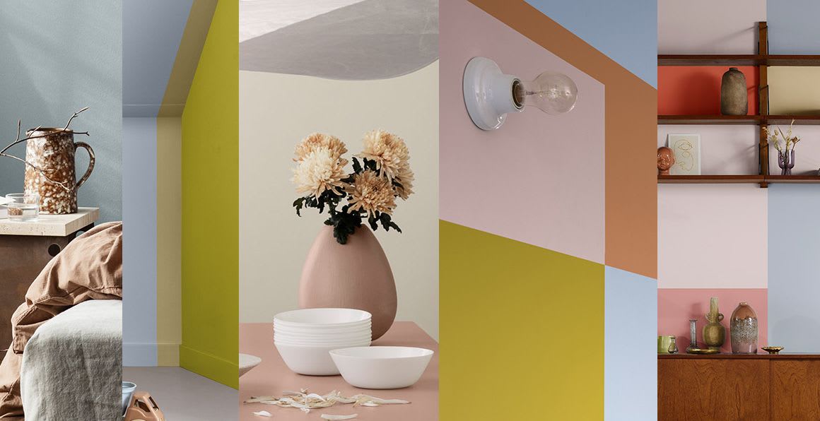
As Jotun Color Manager Lisbeth Larsen says , "This year's color palettes are designed to reflect and highlight different aspects of personal needs and lifestyle. The colors enable you to create the mood you want for yourself and your loved ones."
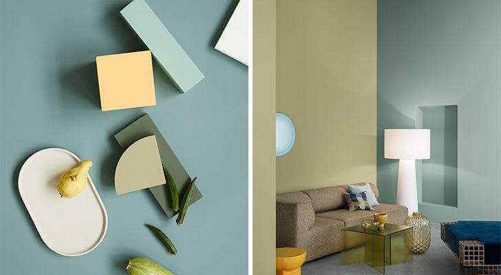
Playfull "Freedom to be creative and full of joy" , the color palette lives up to its name and features many encouraging turquoise and green tones, fresh yellow tones and dusty lavender.
We are becoming increasingly daring in our decor, and here we see the trend of daring to stand out with surprising elements of color in an otherwise neutral color palette.
As Jotun says so beautifully here, "sometimes life feels too short to walk quietly in the doorways"
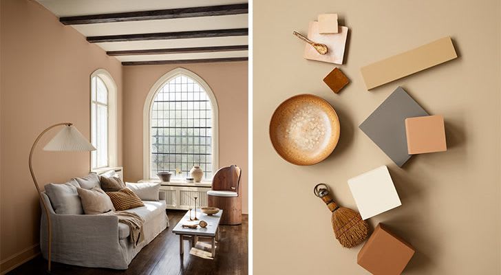
Embrace color palette, "create space for precious moments." Here we have color tones with names like Iron Blue, Rusty, White Tea and Shade, which give us associations with natural colors. We see many different rustic shades of earth and stone, which should give a feeling of calm and security.
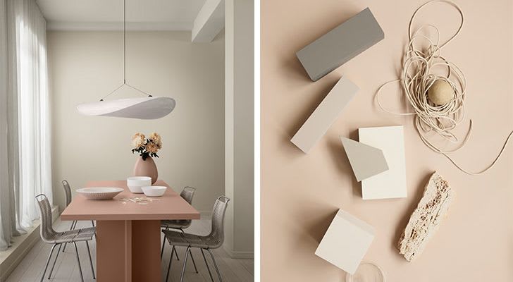
"A space for conversation, reflection and togetherness," the Cherish color palette celebrates the safe base of the home with its comfortable mix of neutral, bright and muted tones in peach, pink and green shades. Soft, calming colors such as Frost Smoke, Soft Comfort, Pale Linden and Thoughtful are found in this palette.
Nordsjö has also come up with a really nice color palette for 2022 along with the color of the year, Bright Skies™ . They present vibrant colors and bright tones, after a period where neutral and muted colors have dominated - quite possibly this is a reflection of our need for positivity.
Greenhouse – Let’s celebrate the positive qualities of nature for our health and well-being, with fresh green and blue colours, which keep us in touch with the natural part of the world. In rural environments, these colours can complement the surroundings and in urban environments they help us feel connected to nature
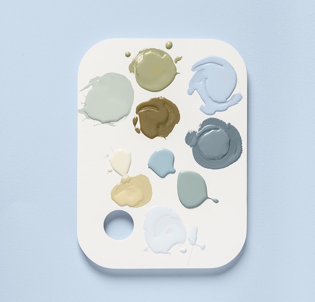
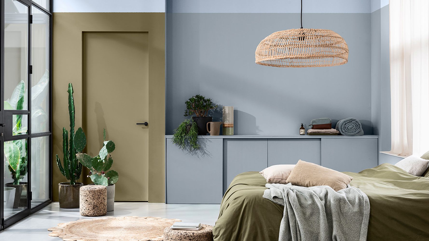
Workshop – When a living space needs to quickly change roles from home to office, or a place for study, we need flexible spaces. Together with Bright Skies, the “Workshop” color palette, with its combination of bright and uplifting shades, can help us create an inspiring backdrop for any activity.
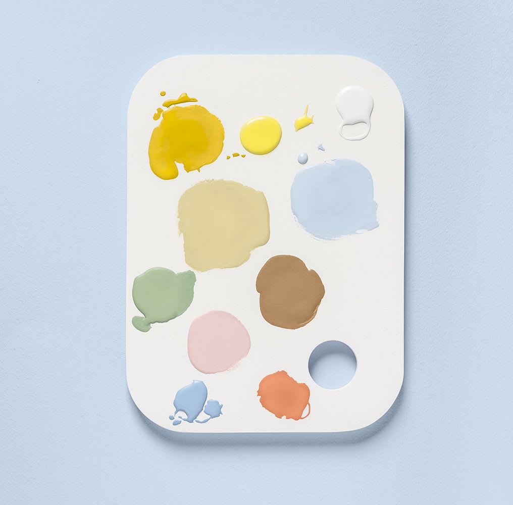
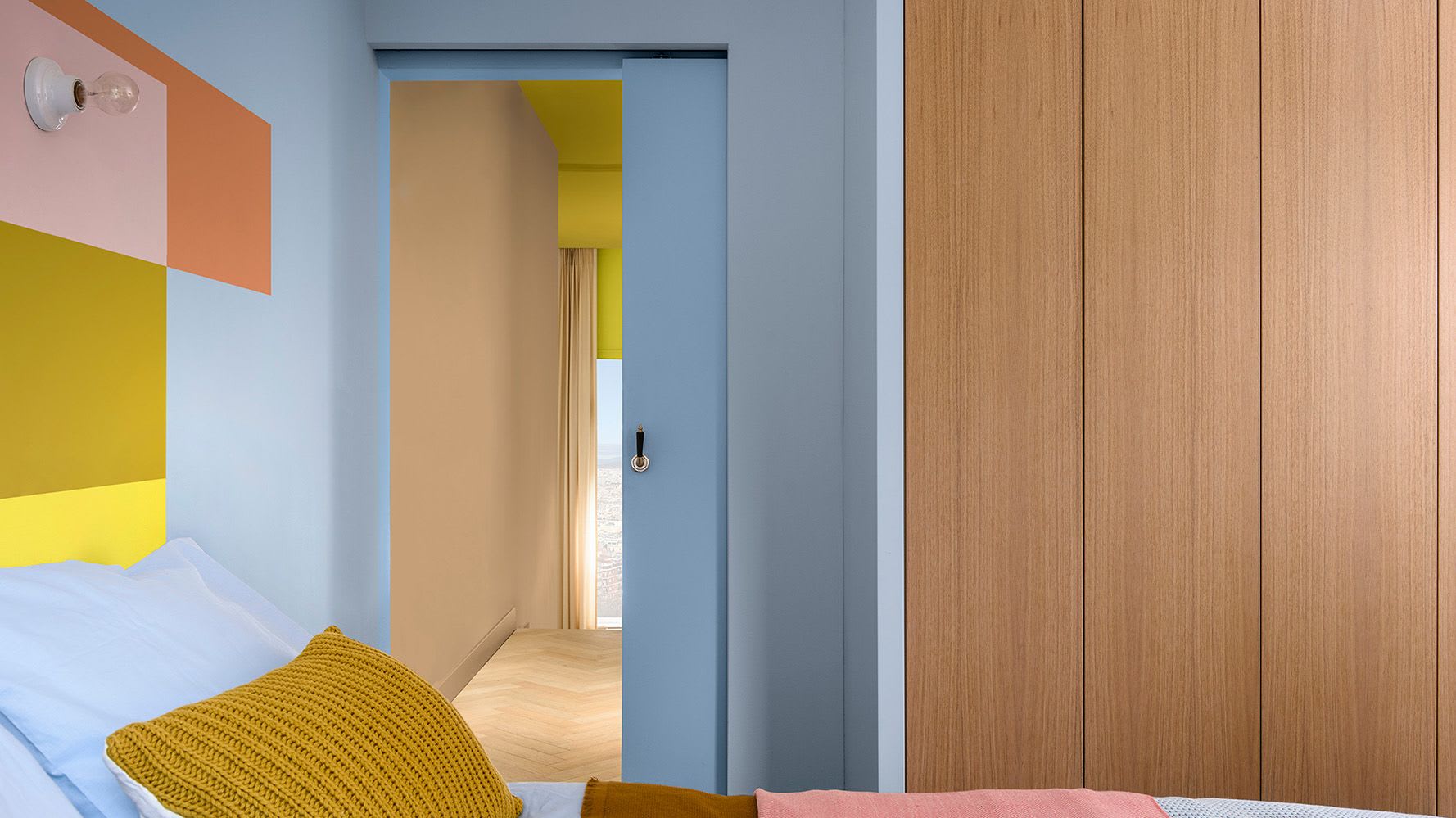
Studio – We all need a place to recharge our batteries and be inspired; a space with distance from everyday life. By painting the walls with these pale pinks, reds and oranges - along with Bright Skies - the room can have a comfortable and safe atmosphere.
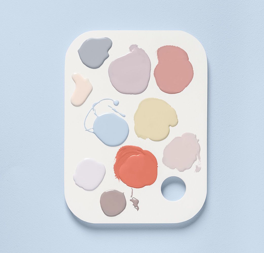

Salon – Turn your space into a blank canvas, ready to embrace new ideas. Create a sense of openness with soft whites and muted tones that are both fresh and unified.
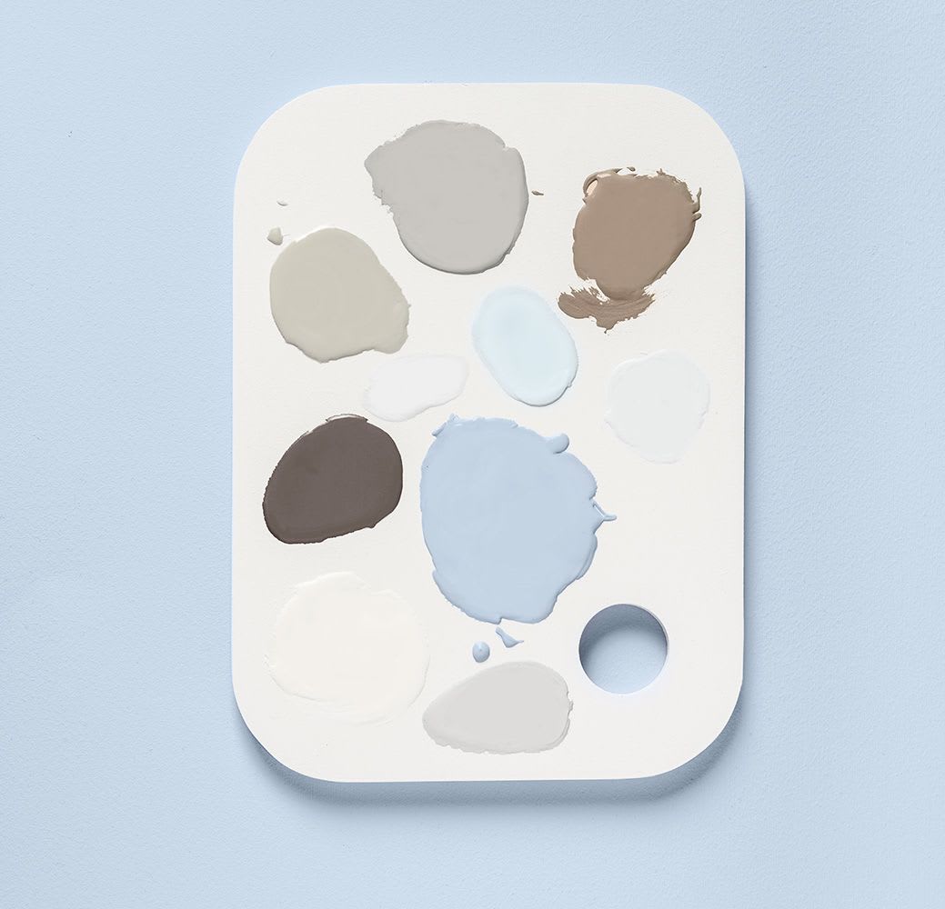
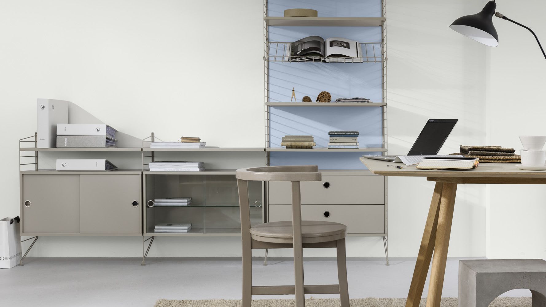
"In 2022, Bright Skies will help us embrace new ideas and the dream of a new future," says Ann-Charlotte Linde, Nordic Color Manager at Nordsjö. We see these trends and currents making their mark in interiors as early as fall 2021. Use color and texture in interior details to steer the color palette in the direction you want, and that brings you joy!
Photos: © Nordsjö © Jotun